Great analysis about the usage of figures in politics: http://flowingdata.com/2011/12/12/fox-news-still-makes-awesome-charts/
What’s wrong with this figure?
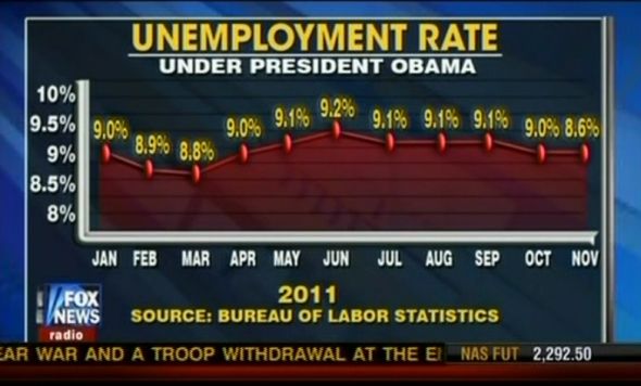
See the original post for the answer.
Great analysis about the usage of figures in politics: http://flowingdata.com/2011/12/12/fox-news-still-makes-awesome-charts/
What’s wrong with this figure?
I am a community ecologist with a broad interest in data analysis.